This case study is based on my task at Qasir. Qasir Webapp is backoffice of Qasir POS Mobile apps, main focus of Qasir Webapp is to provide more detail report for Qasir POS user.
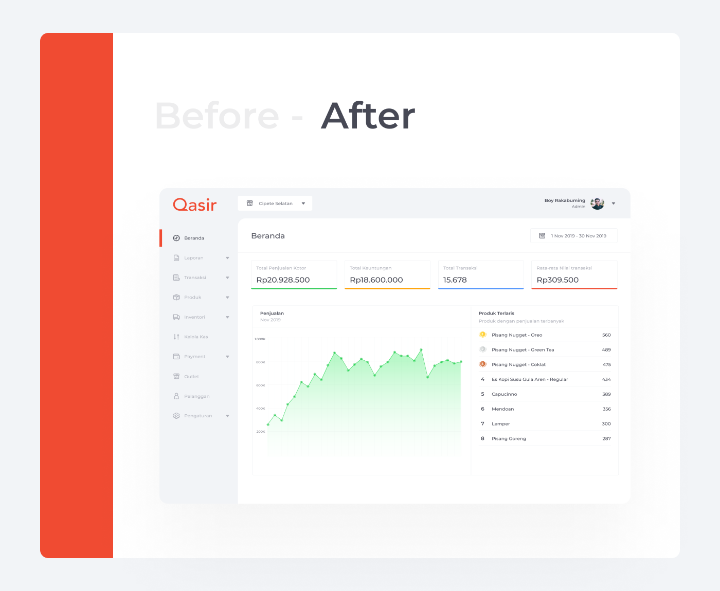
Design of Qasir Webapp is based on template and never get maintain for 2 years because our resource mainly focus to mobile apps. With limited resource, we decided redesign this webapp. Redesign in this case is we just updated the current design with our design system, not the flow, and also make Qasir Webapp mobile friendly.

At this phase i analysing the current Dashboard page. Beside the UI component, from my note, these are things that can be improved:

Horizontal navigation bar looks good if you have 1 - 5 menus. If you have more than that, i think make the menu to vertical mode is best practices because it's easier to scrolling vertically than scrolling horizontally on the web

Quoted From Smash Magazine : "Bread crumb is a type of secondary navigation scheme that reveals the user’s location in a website or Web application. Use bread crumb navigation for large websites and websites that have hierarchically arranged pages. An excellent scenario is e-commerce websites, in which a large variety of products is grouped into logical categories."
In this page, it just have single level page. So i think it's save to remove bread crumb
I set up 1 personas based on user who used Qasir POS. I referred to them throughout this entire UI case study. Persona had a scenario that identified a realistic goal the user might have when working with this app. The information about each persona focused on its goals and frustrations, which affected my design decisions.
For the typography, our design system use Montserrat font. We decide to use this font because this font have character that makes your web modern but not to formal. Font family we used is Semibold and medium, and Font size is starting from to the smallest 12px to largest 24px.
For the icon set, our design system use Dopeicon. We decide to use this icon set because it's have all icon our needs, match with our character, looks modern, and also of course it's speed up our work.

For the color, Primary color we use is #F04B32, and for background i used secondary color #F2F4F7.

Consistent spacing can make the whole design cleaner, also it giving elements a visual hierarchy. For spacing we used multiple of 8 px, smallest is 8 px and largest is 32px.
After crafting asset, next step is crafting component. When designing this layout component, I did 3x iterations, from the red colored navigation menu (1), then the combination white navigation menu with grey (2), and after looking some inspiration finally i decided to use the navigation menu design (3), the layout looks modern with combination of grey on the side and upper navigation.

This is component of menu. When active state, red bar will visible and the color of icon & text become #474955, when In-active state red bar will hidden and color of icon & text become #B0B2BB.
This is design after we completed the layout and navigation menu.
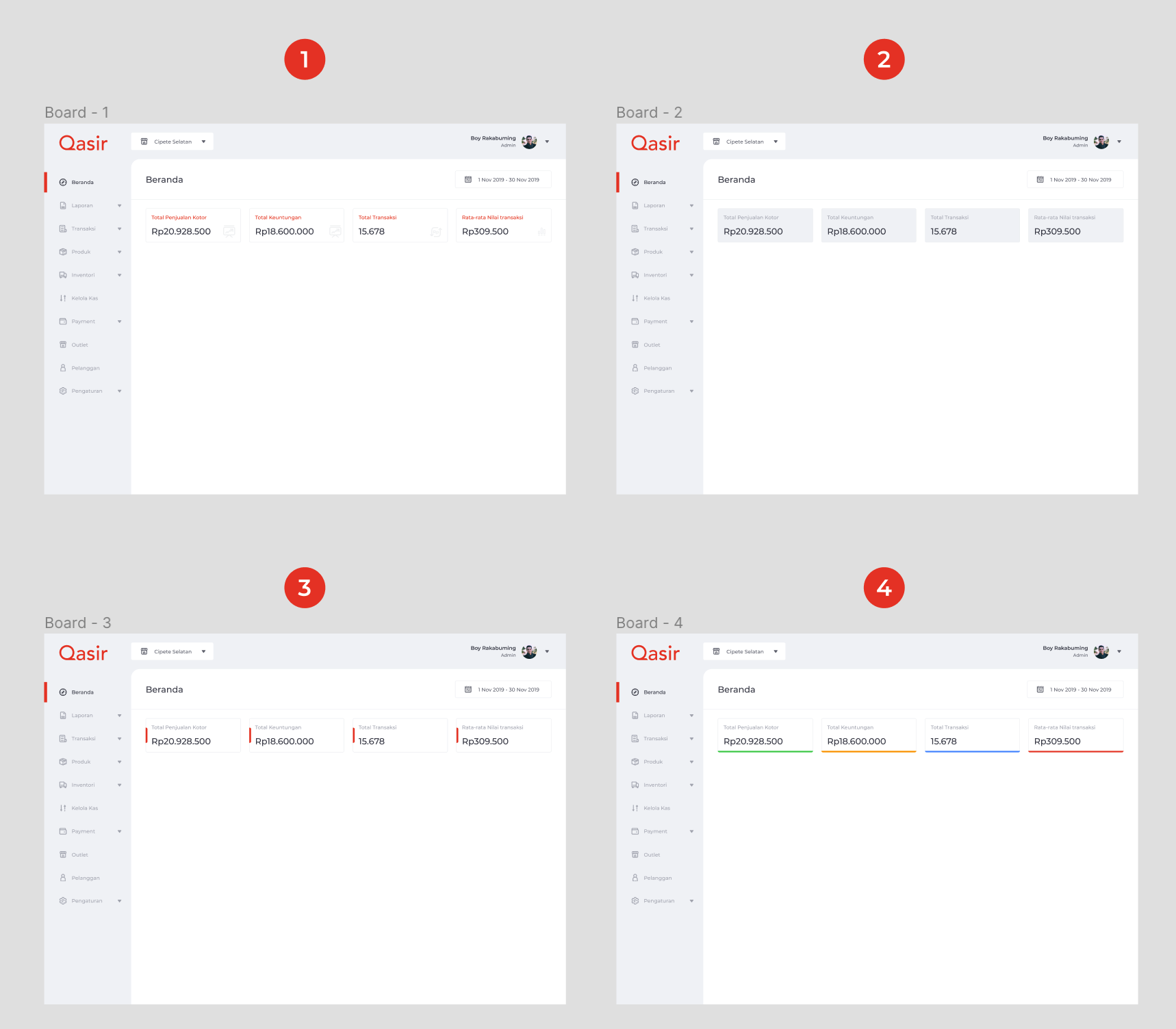
When designing this layout component, I did 4x iterations, from the red sub-titled summary (1), then grey background (2), red vertical bar on the side (3), and after looking for advice finally i decided to use the complementary color bar for summary (4).
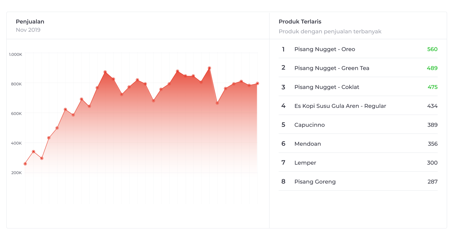
When designing this layout component, i did 2x iterations. First i used red coloured chart to match qasir brand color, but i think it doesn't look good because red on chart means error or decreased event. For the top product list i used green color to indicate that they are top 3 product list.
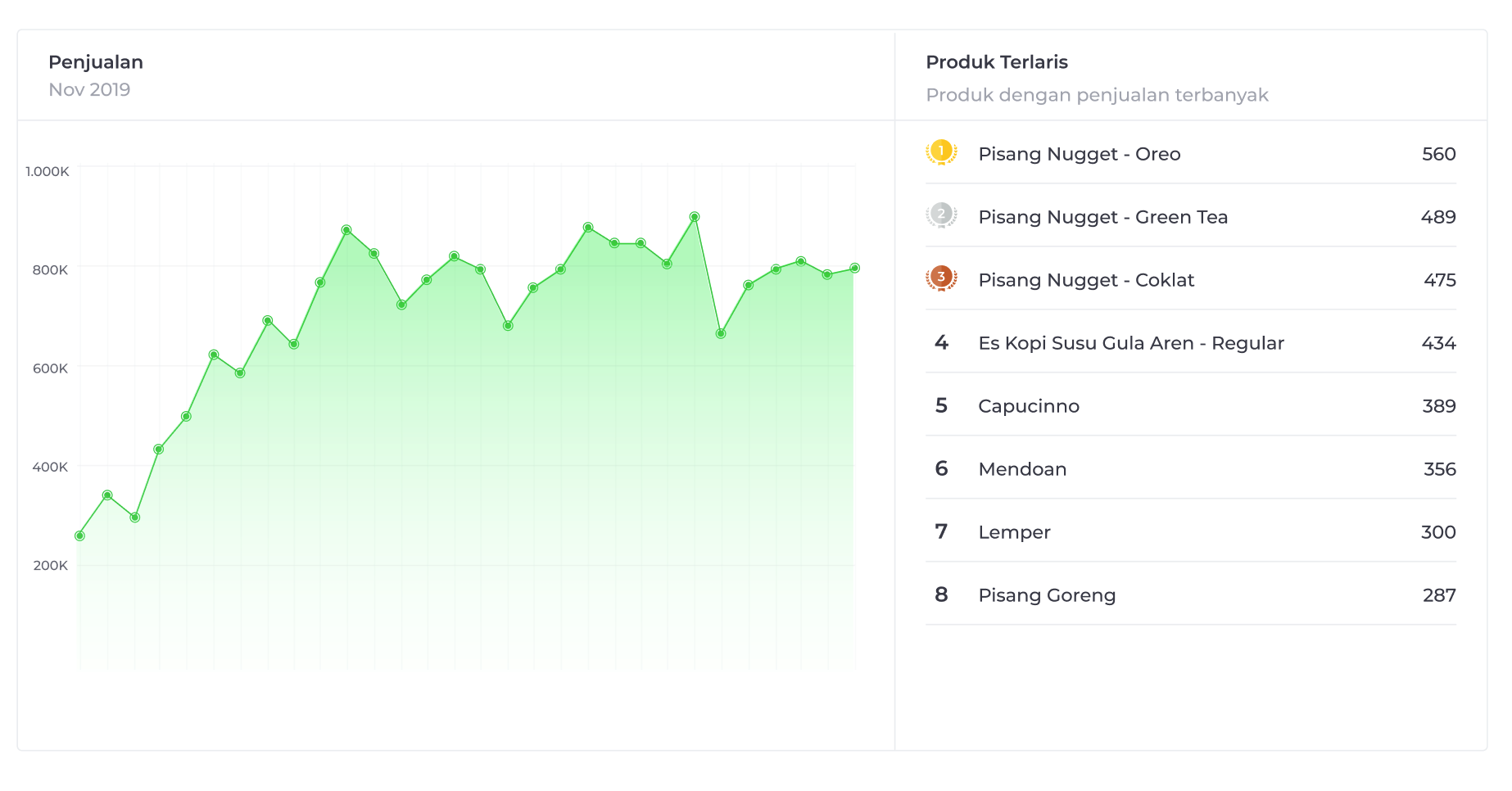
To make more good impression for user, i decide to make the color of chart become green, green means success and increasing event. For the top product list i decide to used gold, silver, bronze icon to make it more fun for user.
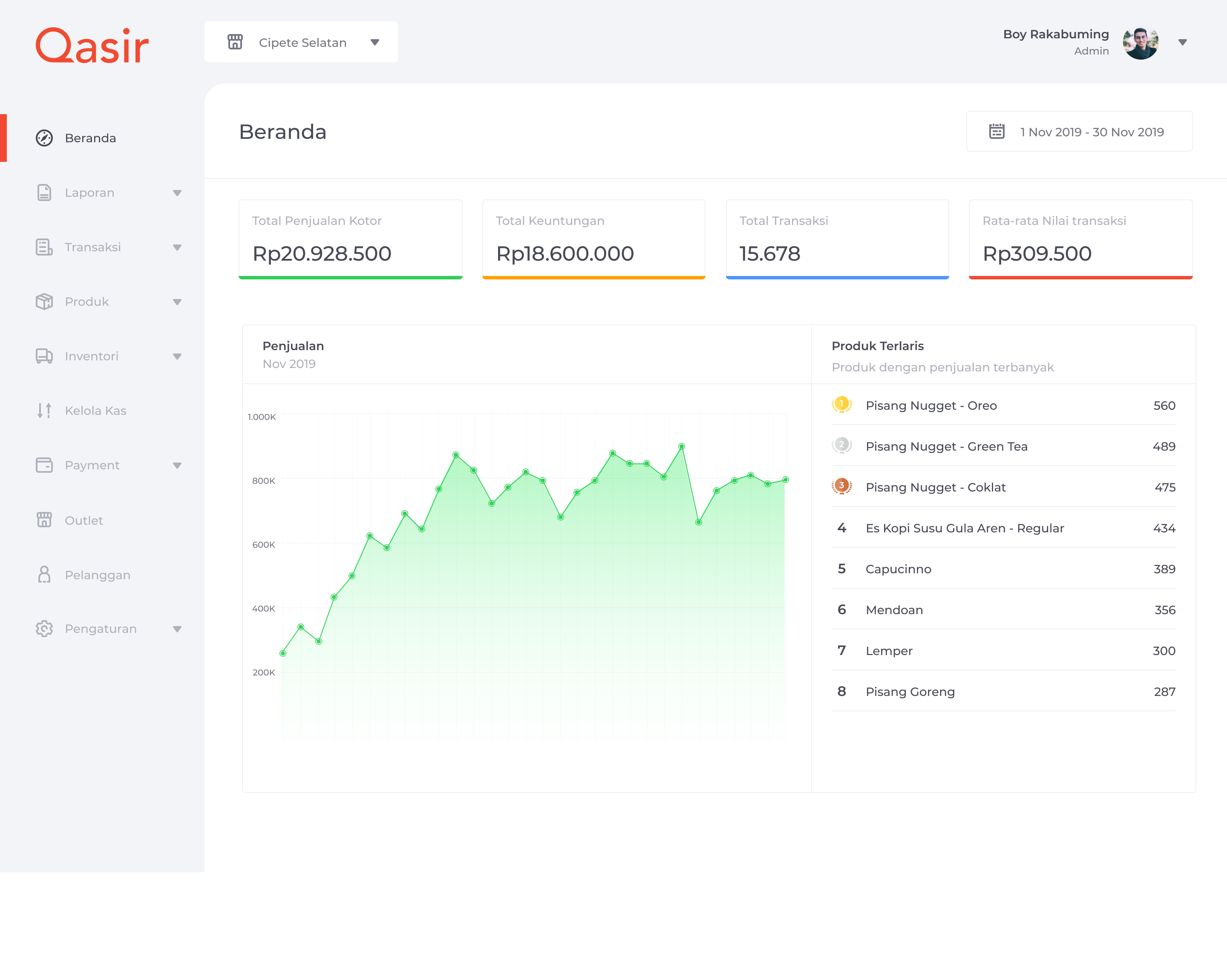
This is design after we completed the summary transaction, chart and top product list component.
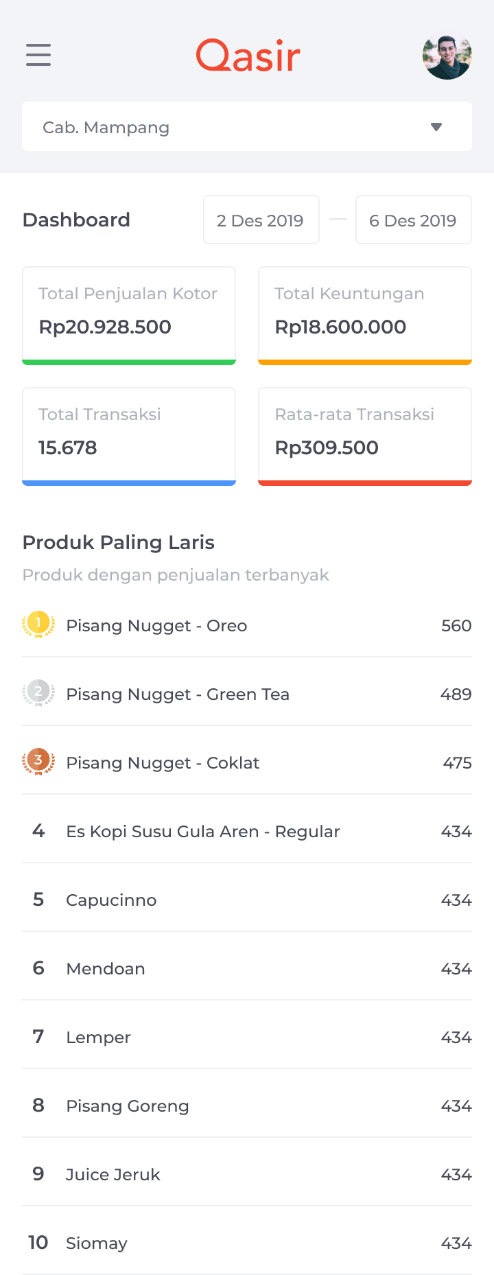
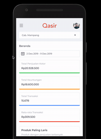
This is my first iteration of responsive view. As you can see I made the calendar filter separated by 2 input, after title bar, and summary transaction component 2 column per row.
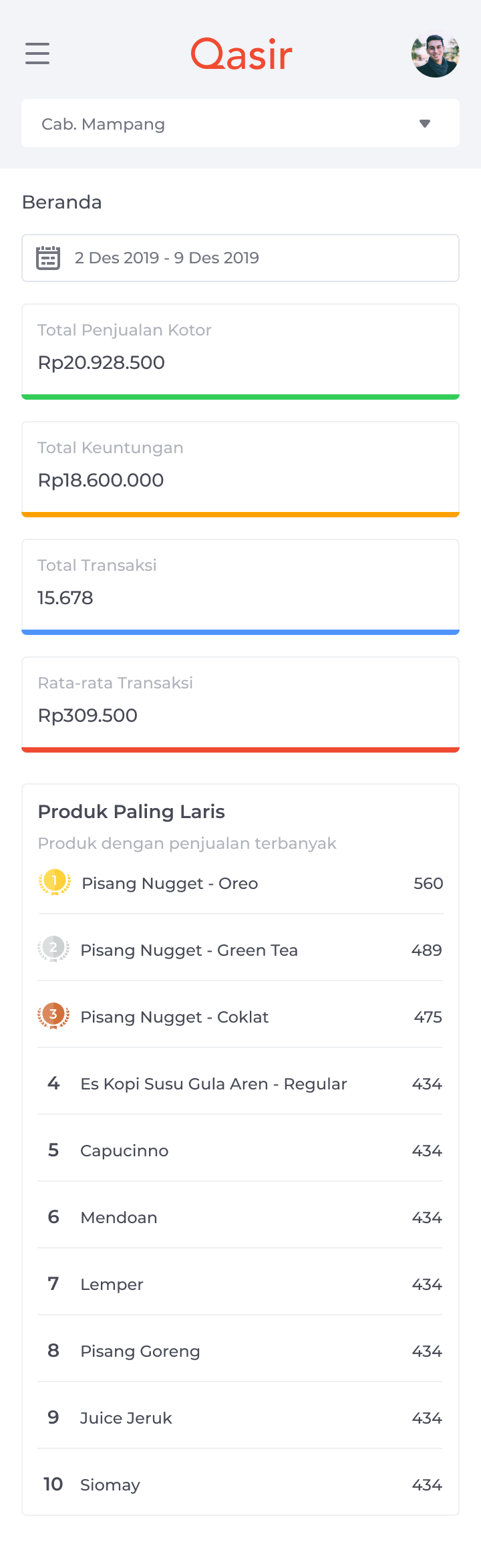
After discussed with adhit, my UX Engineer, he explained, if there's huge number in summary component, the number will expand to bottom that's will make the design messy, so t's safe to place the calendar filter below the title bar, and the transaction summary 1 row per column. Then i agree to take that advice.

This is little interaction when user tap on hamburger icon & profile icon