it all began when one of my co-workers showed me a UX co-creation challenge held by Jenius, one of the most popular digital banking in Indonesia under BTPN. It allowed UX enthusiasts to collaborate their ideas and designs so that they might create their own brand new interactive UI/UX design of the Jenius apps to develop a better users’ engagement through UX.
So, why not give it a try.

When it all comes to problem-solving, it indeed requires a suitable approach to achieve what might cause a better result. Design thinking has been a-well-known problem-solving methods among designers or early start-up. Not only did the event holder recommend teams to apply such methods but we also felt that it suits well considering it enables us to dig deeper problems and to bring all our ideas on board. So, this is how we planned on doing it.
Our UX Researcher got her hands and mind involved in approaching and getting as much information as possible from Jenius app’s users through some open interview sessions. Note that the interview was conducted to 15 users who have used the Jenius apps for 7 months to 2 years. We didn’t only take notes on what might be the problem but we also tried very hard to put ourselves in the users’ shoes so we understand the pain. The goal of the interview is to get what might be defined as the pains in users’ daily use.
After a long information gathering process, we finally sat in front of our computers to hold a design sprint. Our UX Researcher had gathered all of the user stories right before the meeting started. So, the next step is to discuss what matters and what doesn’t.
It’s time to eliminate similar stories.
Most of the interviewees said similar concern about the apps, which is :
"That Jenius app was kind of confusing because it has too many features that I might haven’t acknowledged and used in my daily life."
The next step is to put the users’ concerns we’d like to get in this research to the board. Here are the user stories and real problems that we have defined together in a team discussion.
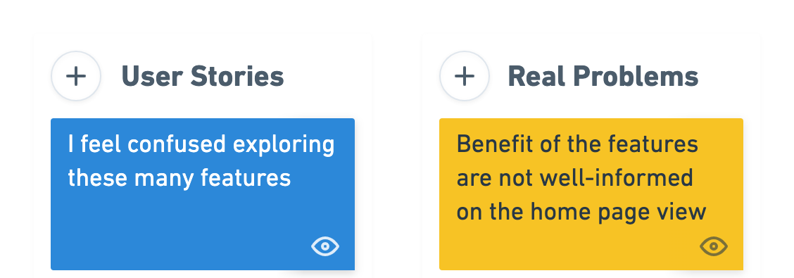
There are at least 1 main issues that we’re trying to solve in this case. The first one would be the ineffectiveness of the features of information delivery.
The next step was to define How Might We notes. We defined what we could do to deliver a better user experience based on the solutions we also had defined.
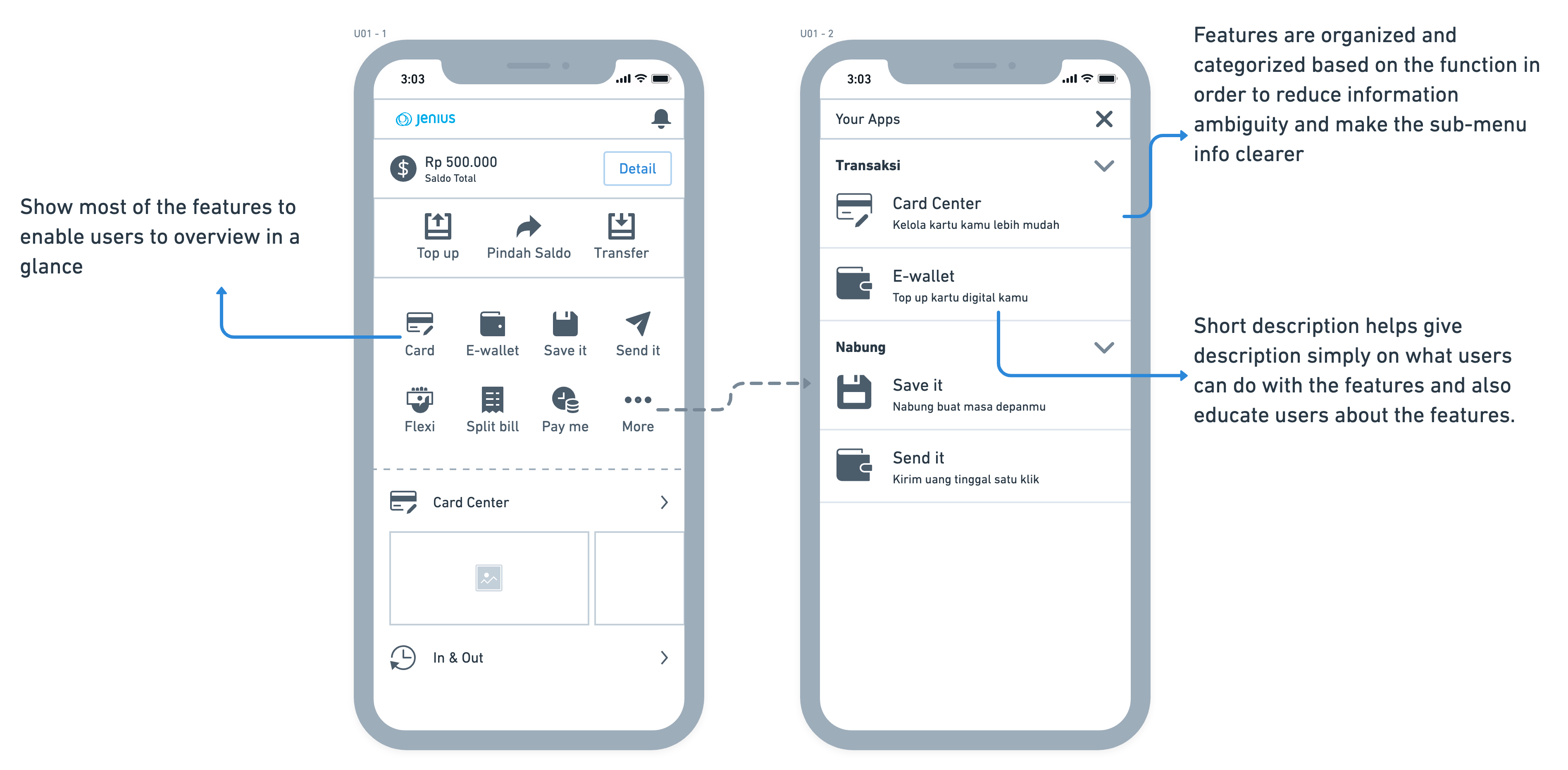
We argued if burger navigation has been a problem for hiding the useful features Jenius app has. As all you can see, we are unable to see due to the hidden features in the burger navigation bar itself. Therefore we considered that every time users launch the app, they must be able to see other superior features on the homepage.
Here are the solutions and how might we note we defined.

Before going to the hi-fi prototype, we decided to map out all the ideas into some sketches and gather all the thoughts on them.
I translated How Might We notes into a visual design solution to deliver an informative and reasonable justification into it. So we always know why we decided to go this way.
After the debate and discussion on the design and we agreed on the experience implementation, then it’s time for Randy to let his magic work. The design was done in Figma.
Here are the results of the design that we proposed.

In order to validate our ideas, we went to test the design by coming to the users and see their reaction so we could get feedback. We used Maze to help us gather accurate user feedback. We’re so happy about this app because it’s so helpful to be able to integrate with Figma.
The usability-test was conducted to 11 active Jenius users who have been using Jenius for the same amount of time.
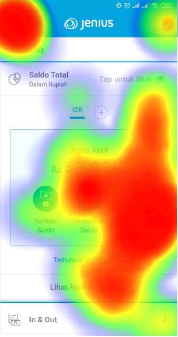
The insight was that most of them would tap on the burger navigation bar and see what’s on Jenius. It proves that the current Jenius home feed is unable to show a piece of whole information about what Jenius really has as features.
There are several steps that users went through. First, we showed them a current Jenius home feed and empathized with how they felt about exploring Jenius features.

This is how users feel about how they explore Jenius features on the current apps.
The insight was that most of them would tap on the burger navigation bar and see what’s on Jenius. It proves that the current Jenius home feed is unable to show a piece of whole information about what Jenius really has as features.
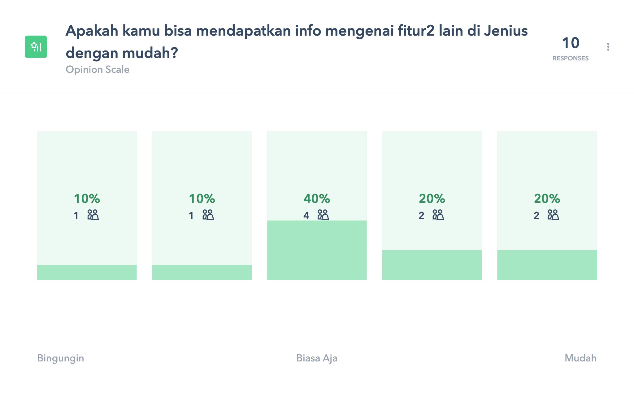
It doesn’t mean that the current Jenius home feed delivers bad user experience. The statistic proves that 40% of users have no concerns about the features being shown that way.
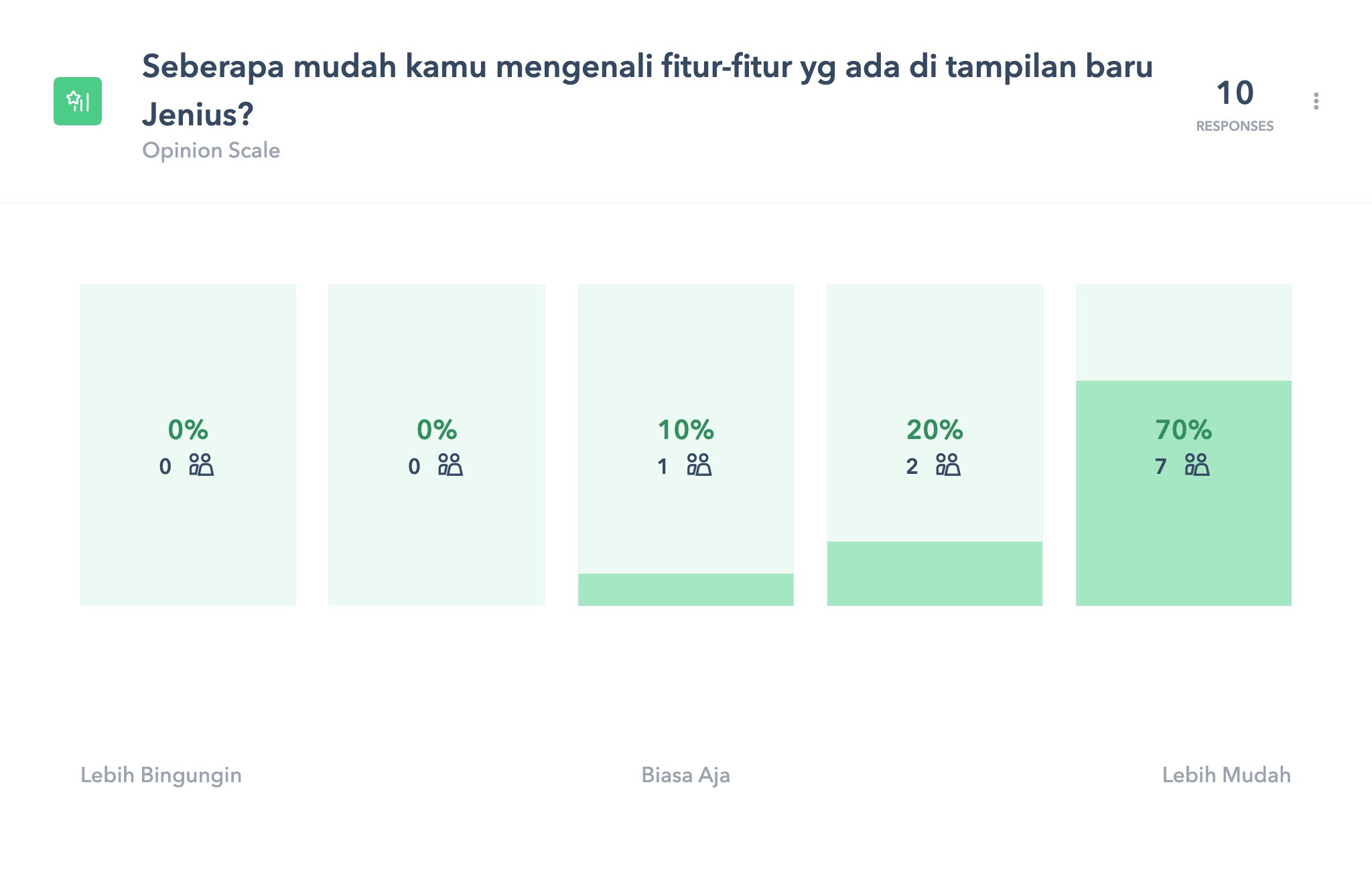
Then we showed them the new home feed design and asked how they felt about it. Especially how it affects their engagement in order to explore the features better.

But then, this is what the users feel about exploring features on the new Jenius home feed.
Surprisingly, the new design has significant improvement. Users feel that showing most of the features on the home feed has increased their awareness through such features.
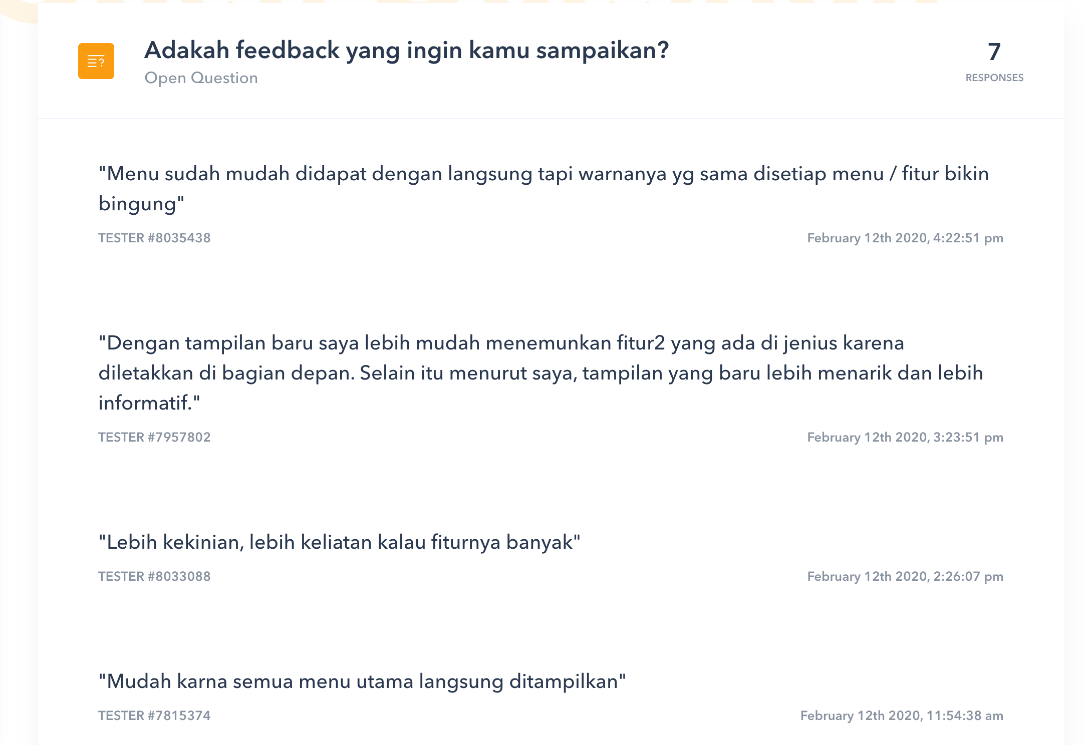
In case you’d like to see how the whole testing was summarised, you may check it here.
The final prototype has a lot to possibly improve in many ways but it’s a good way to go so far. We have also a lot to gain from the case study and it was a great learning experience. We hope to continue to grow in product design, especially in implementing design thinking in our work life. Special thanks to Ecky Alimansyah & Tiara who collaborates with me in conducting user research in this case study.